Rivertys Design System Aims
Minimize total effort spent on envisioning, designing, developing and maintaining Riverty user interfaces.
Minimize unintentional or inconsequential differences within the totality of Riverty user interfaces.
Keep fit to purpose for Riverty’s products, priorities, and operating context.
Identify and codify common patterns, make them discoverable and easy to apply.
Maintain a high level for relevant quality attributes within user experience, visual design, and frontend engineering.
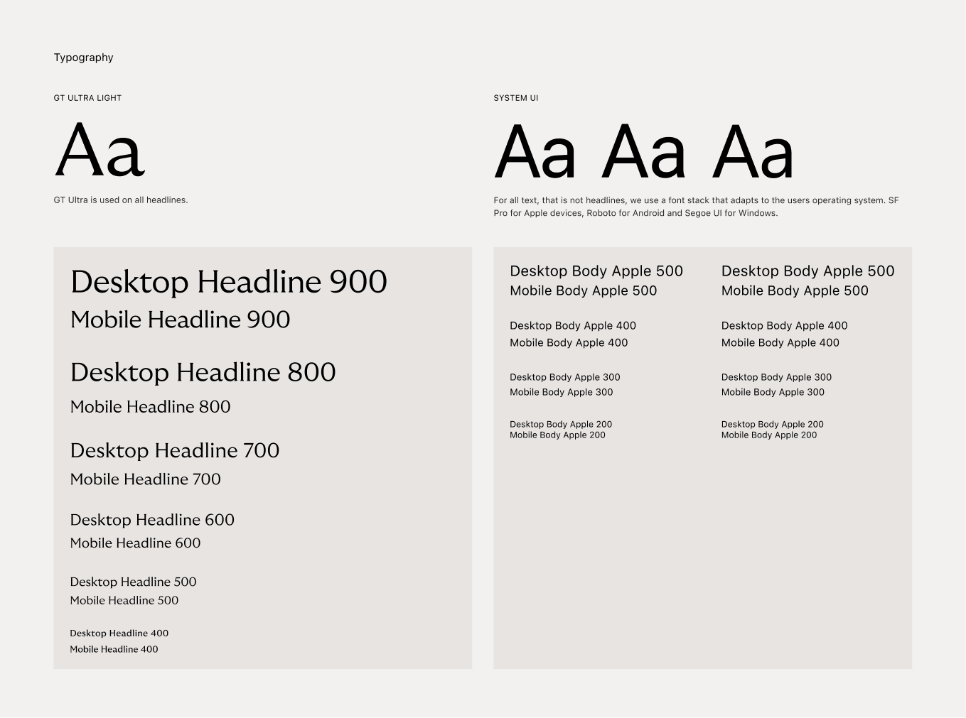
Typography
Based on corporate branding guidelines, GT Ultra was chosen as the headline font for all Riverty products. At smaller sizes and in numerals, the legibility of the fonts was compromised and it was decided to use the system-ui font stack for all instances other than headlines. This was done partly to ensure compliant readability, and partly to provide a more native experience.
In the first and current version of the typographic tokens, they are treated as basic text styles published as a library in Figma. Currently, the entire typography for digital products is being reworked to allow for more flexibility and use of Figma variables.
See more details on riverty.design/tokens/typography
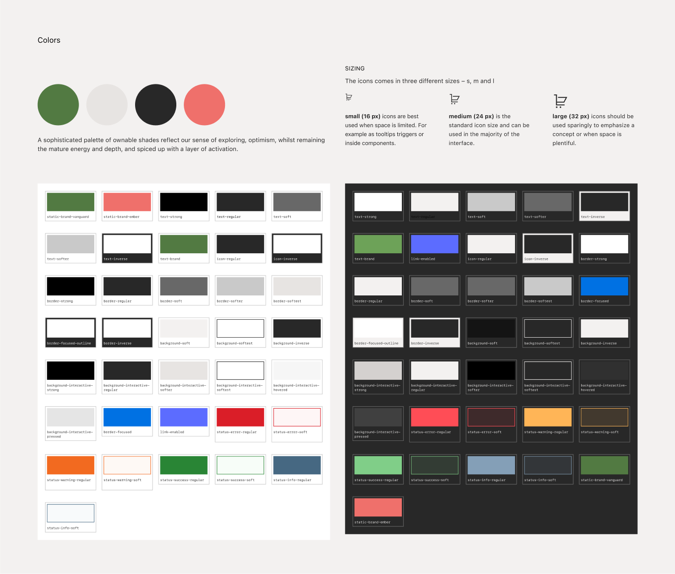
Color System
Based on existing brand colors, we have developed a color system that caters for themeing - in this case light and dark mode. The process to define a new color system consisted of a lot of explorative workshops where we started with investigating what models and processes could be used. Drawing some inspiration from Material Designs layering to acheive variation and interaction states we concluded that we needed to build and develop our own model. In our work we could pretty soon conclude that we didn't need to design any new colors, but rather use the existing colors Charcoal and Haze to accomodate for light and dark mode.
We have implemented all colors as variables in Figma to easily and quick apply color modes. We have also applied a semantic token naming layer fronting the people designing with the design system. Meaning that the colors are namned for their intentional usage, for example: text-regular, text-warning, background-soft, background-inverse.
A secondary palette with semantic values (like success, error, warning, information) has also be designed to fit the overall brand and UI-colors.
See more details on riverty.design/tokens/color
UI-Icons
UI icons are small graphical representations of a functionality or concept. They provide users with quick and recognizable visual cues that are easy to understand.
With rapid product development and ever increasing needs of icons we sourced for a ready-made icon kit that would fit our needs but also match Rivertys overall visual esthetics. As a cross-department (design system, product design, front end development and brand marketing) exercise to collect requirements. We ended up chosing Streamline Sharp Line, since it harmonises well with Rivertys assets charachteristics, matches the requirements regarding grid, stroke and sizing and also has a rich set of icons.
See more details on riverty.design/assets/ui-icons
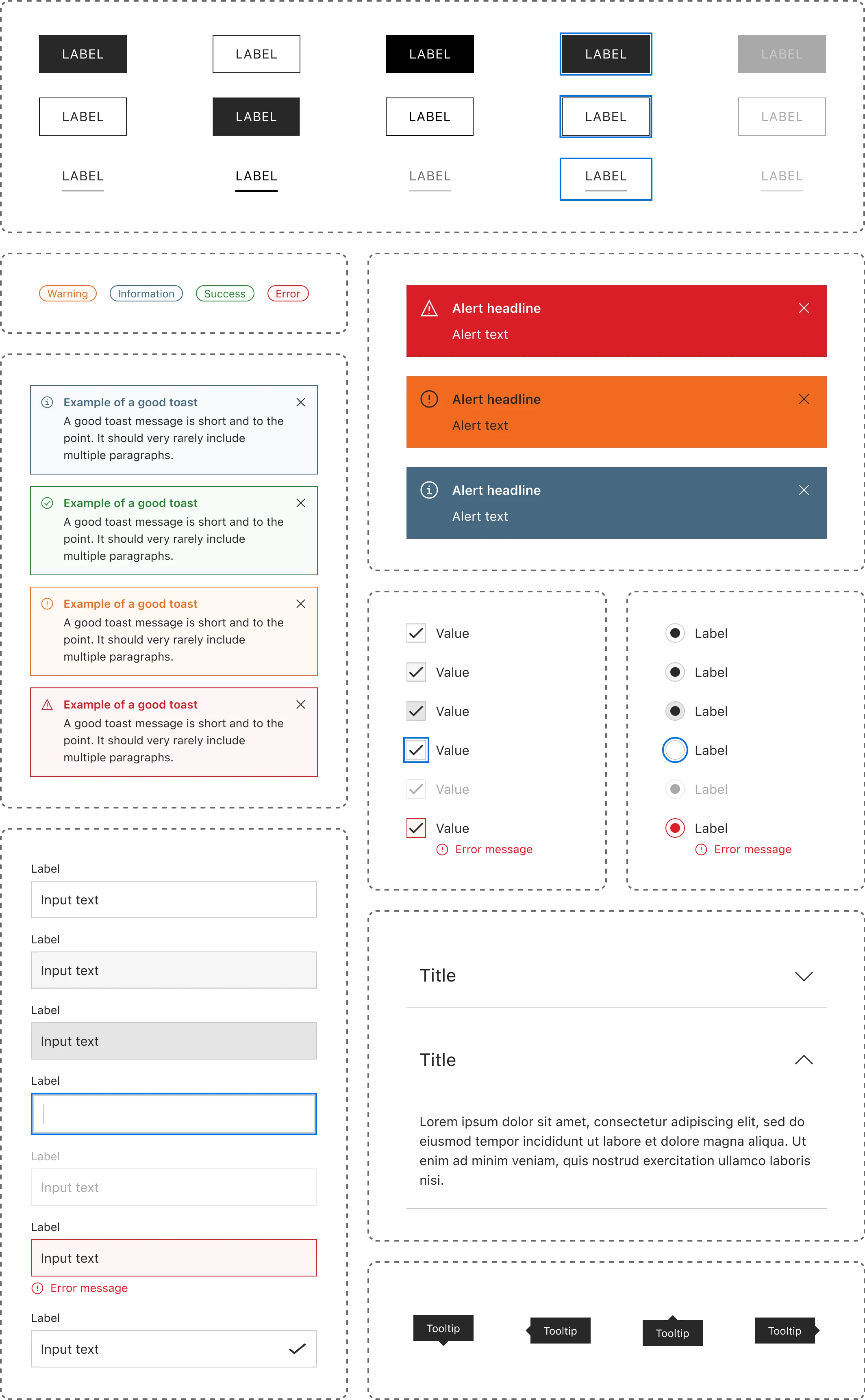
Components
Design system components come are distributed in two ways — in Figma and in code. For designers, components are ready-made building blocks that make it easier to create high-fidelity, consistent screens. For developers, components are standards-based web components that can be used in any web codebase. For cross-functional teams, design system components smooth collaboration and remove ambiguities.
We established processes to identify and prioritize the components that should be developed. Additionally, significant effort was dedicated to streamlining the interactions, patterns, and visual characteristics of these components.