Rivertys UI Experience principles
To achieve end-user satisfaction, coherence and brand retention in Rivertys products, I developed three principles for user interface design. The three principles originate from Rivertys brand statements and overall UX design principles and are adapted to the context.
The principles help to give an overall direction to the look and feel, and consistency of Rivertys UI:s.
Make the user feel at ease
Design restrained, provide clear direction, eliminate confusion and do not overload the designs.
Make the user feel secure
Design purposefully, accurately and consistent to make the user perceive confidence in our products.
Make the user feel confident
Coherency through our products gains both trust and brand retention.

Password free login
The goal of the password-free login was to make it easier for users to access the product. The UI is designed to make the user feel comfortable - few components and interactions. It's purposefully designed and reuses user interface components that are familiar to users.

Get on top fast
Users can quickly see which purchases have been paid for and which have not. By differentiating purchases with different card designs, users get the confidence and direction to know what to do.

All details in one place
The Purchase Details page gives the user a granular view of what and when. Important dates and necessary product data are presented. Accuracy and consistency are key.
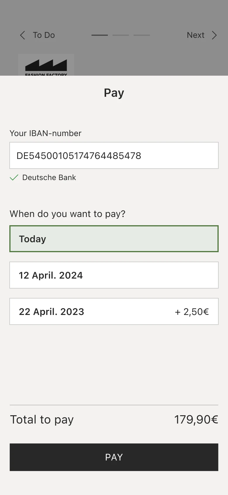
Flexible payment
Depending on the payment methods available in the user's country, they will be presented with different options. The user also has the option to pay immediately, on the due date, or extend the due date. Clear user direction and uncluttered design.